Static Slide vs Progressive Reveal: A Task-Based Decision Guide
A complete slide gives the audience freedom to inspect the material. A progressive reveal gives the presenter control over when each part appears. Neither approach is always easier to follow. The better choice depends on the work the audience needs to do.
If people must compare two alternatives, keeping both visible may help. If they must follow a sequence of changes, revealing each stage as it is explained may make the sequence clearer. Trouble begins when the display format conflicts with that task: a comparison arrives one option at a time, or a step-by-step explanation appears as a finished wall of information.
You can make the choice more deliberately by considering the relationship between the elements, the audience’s familiarity with the subject, and whether someone else will use the deck without you.
Define the two options clearly
A static slide presents its relevant material together and leaves it available while you explain. It can still have strong visual hierarchy, direct labels, and a clear headline. Static does not have to mean dense, and it does not mean the presenter must talk through every item.
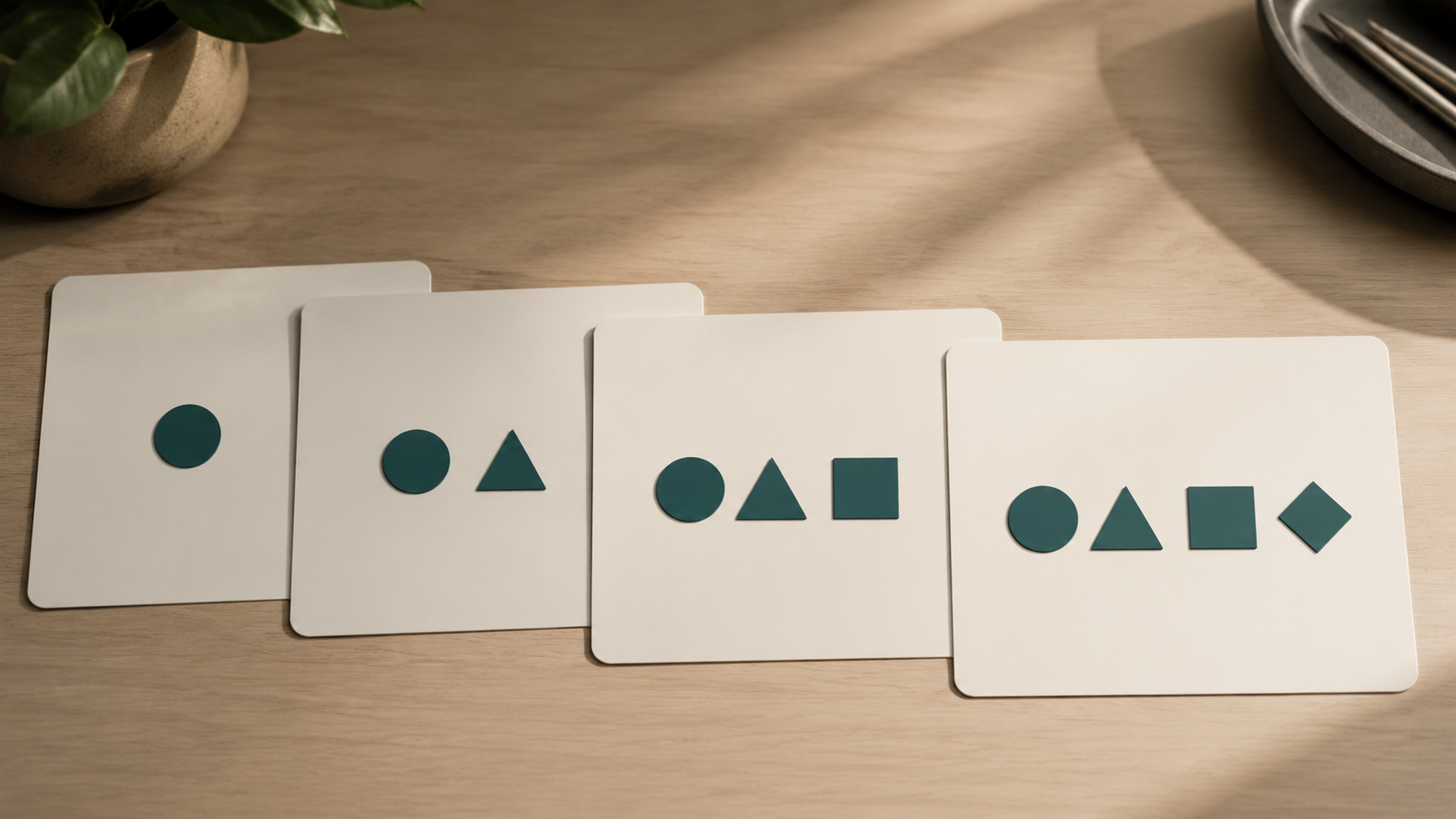
Progressive reveal introduces material in stages. A new step, annotation, or consequence appears when the explanation reaches it. Previous information may remain visible or be replaced. The specific choice matters because removing earlier material creates a different task from building a complete picture gradually.
Decorative animation is separate from this decision. A slide can reveal information simply without having objects bounce, spin, or travel across the screen. The instructional question concerns timing and availability, rather than visual entertainment.
Use a static slide when comparison is the main task
Imagine a hypothetical team choosing between two room layouts. The audience needs to compare capacity, accessibility, and the position of the entrance. Showing one layout and then replacing it with the other forces people to remember the first while inspecting the second.
Place both layouts together at a readable size. Label the relevant differences and explain which criterion matters for the decision. The audience can move between the alternatives as needed. A clear visual arrangement does more useful work than a sequence of reveals.
The same logic applies to before-and-after examples, short sets of options, and diagrams whose meaning comes from the relationship among parts. Keep the information required for the comparison available at the same time.
Use progressive reveal when order is part of the idea
A worked example can benefit from showing how each decision changes the situation. In a hypothetical troubleshooting lesson, you might begin with the symptom, reveal the first check, explain its result, and then show the next branch. The sequence mirrors the reasoning you want learners to follow.
Keep earlier steps visible when the next step depends on them. If each click wipes away the context, the audience may have to reconstruct the path from memory. A gradual build can preserve a record of the reasoning while limiting how much new material appears at once.
Explain why the next element appears. A reveal should correspond to a meaningful change in the argument or process. Adding every word separately rarely helps listeners understand the relationships among words.
Do not confuse presenter control with learner control
The segmenting principle in multimedia learning describes benefits of presenting multimedia messages in user-paced segments rather than as a continuous unit. That distinction matters: a learner choosing when to continue is different from an audience following a presenter’s clicks.
A live reveal can create useful boundaries, but it does not automatically give every listener enough time. If you click quickly, learners who need longer still have no control. The research principle should not be reduced to “animation improves learning.”
In a recorded or interactive lesson, consider whether learners can pause, review, and move forward when ready. In a live session, leave room for questions and inspect whether the current step needs more explanation before advancing.
Match the support to the audience’s familiarity
A beginner may need help identifying the components before seeing how they interact. An experienced audience may prefer the complete display so they can inspect the exception or comparison that matters to them. These are useful planning considerations, not fixed rules about every novice or expert.
If the group is mixed, provide a brief overview and then focus on the difficult section. Name the parts that some viewers may not recognize, but avoid making the whole room wait through unnecessary clicks for familiar information.
A simple question during preparation can help: what would someone unfamiliar with this slide need to understand before the next element makes sense? If the answer is substantial, build in that explanation rather than assuming the reveal supplies it.
Use a hybrid when the audience needs both context and guidance
You do not have to choose one format for the entire deck. A complete process map can establish the structure, followed by focused slides explaining the most difficult stages. A static comparison can gain one annotation when you reach a particular detail.
Another option is to keep the whole display visible while highlighting the current focus. Make the cue precise and preserve enough contrast for the other material to remain readable. Our article on using arrows to guide attention explains how to avoid cues that obscure or misrepresent the target.
A hybrid works when each change has a clear purpose. It becomes distracting when the audience must repeatedly learn a new display convention.
Consider what the audience might need to revisit
Progressive reveal can make it difficult to return to an earlier point if the speaker has not rehearsed navigation. A question about the second step should not require an awkward trip through every animation in reverse.
Prepare a stable overview or complete version that you can use during discussion. Know how to reach it, and keep the relevant labels consistent. If the audience will challenge a comparison or inspect the evidence, a readable static display may be the most useful discussion surface.
This also helps the presenter respond flexibly. The presentation becomes a resource for the conversation rather than a path that can only be followed in one direction.
Check the handout and accessible versions
Exported slides may preserve only a final state or may produce several partial pages, depending on the software and export choices. Review the actual file you intend to share. Do not assume the live sequence will survive in a useful form.
Ensure that text remains readable, the order makes sense, and essential explanations are available without motion or a pointer. A recording should allow viewers enough time to inspect what changes. A document may need additional labels or notes.
The original problem with premature information is explored in why showing an entire slide at once can divide attention. The shared version creates a different situation: readers often need enough complete information to proceed independently.
Compare two versions using a meaningful question
For an important slide, make a static version and a simple staged version. Ask a colleague to explain the process or compare the alternatives after viewing one. Focus on where they lose the relationship, what they need to see again, and whether the timing helps.
A preference for the more attractive version is useful feedback about appearance, but it does not establish understanding. Ask a question that matches the slide’s purpose. If the goal is to choose an option, can the viewer explain the tradeoff? If it is to follow a procedure, can they identify the next step and why it follows?
Choose the format that makes that task easier. Static slides provide access to a complete relationship. Progressive reveals organize the arrival of information. Both can be clear when their strengths match what the audience needs to do.