Why Direct Labels Make Presentation Charts Easier to Read Than Legends

A practical guide to replacing detached chart legends with direct labels that reduce visual searching, strengthen accessibility, and keep evidence beside its meaning.

Practical guides to presenting, speaking, and communicating clearly
A practical guide to replacing detached chart legends with direct labels that reduce visual searching, strengthen accessibility, and keep evidence beside its meaning.

A chart can contain the right numbers, use a familiar format, and still leave an audience with the wrong impression. The problem is not always a fabricated value or an obvious design trick. Sometimes the scale makes a modest difference look dramatic. Sometimes two lines appear to move together only because each has its own … Read more
A complete slide gives the audience freedom to inspect the material. A progressive reveal gives the presenter control over when each part appears. Neither approach is always easier to follow. The better choice depends on the work the audience needs to do. If people must compare two alternatives, keeping both visible may help. If they … Read more
A diagram can contain everything an audience needs and still leave people wondering where to begin. The relevant detail may be visible, accurately labeled, and large enough to read. It simply competes with several other equally plausible places to look. Adding one arrow changes the invitation. It tells viewers that a particular location deserves attention … Read more
Too many bullet points make slides harder to follow when the audience has to read, listen, and work out the relationships between ideas at the same time. The problem isn’t the small dot at the start of a line. It’s the amount of language on the screen and the work the slide leaves unfinished. A … Read more
Using images in a presentation works best when each picture helps the audience understand something specific. A photograph can show a detail that would take several sentences to describe. A diagram can make a relationship visible. An unrelated image may make a slide more attractive while giving listeners another thing to interpret. Before searching for … Read more
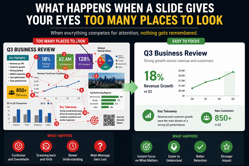
A presentation slide can contain nothing factually wrong and still be difficult to understand. The title is clear, the chart is accurate, the photograph is relevant, and every label technically belongs there, yet the audience spends several seconds trying to decide where to look first. That hesitation matters because viewing a slide isn’t a passive … Read more