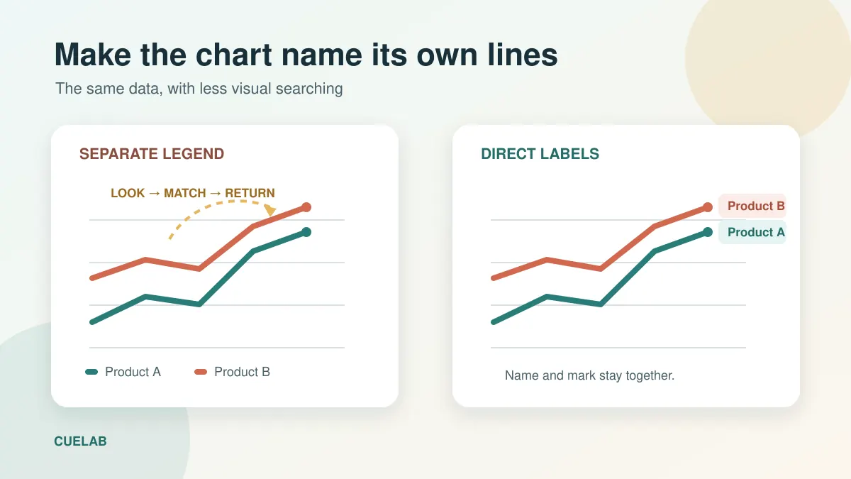
A line chart appears on screen with four coloured lines and a legend in the upper-right corner. The audience looks at the red line, glances across to the legend to discover that red means “North region,” then looks back and tries to find the same line again. Before that small search is complete, the presenter has already moved to the next comparison.
Nothing in the chart is technically wrong. The legend is accurate, the colours are distinct on the designer’s monitor, and every line has a name. Yet the slide makes viewers perform a quiet matching task at exactly the moment they are also listening. Direct labelling—placing a series name beside the line, bar, point, or region it identifies—can remove much of that work.
This is not a rule that every legend must disappear. It is a way to ask a better design question: should the audience have to decode this chart before they can understand it?
A separate legend turns recognition into a lookup task
A detached legend separates two things that belong together: the visual mark and its meaning. To identify one series, a viewer must notice its colour or symbol, hold that feature in mind, move to the key, find the matching sample, read the name, and return to the plot. With several similar lines, the viewer may need to repeat the loop.
On a printed report, that inconvenience may be tolerable because the reader controls the pace. During a presentation, the chart competes with narration, the room, and the next slide. The viewer cannot pause you while checking whether the teal square means renewals or cancellations. Even a small amount of unnecessary searching can be enough to break the thread of the explanation.
This is one reason a chart may be accurate but still communicate badly. CueLab’s guide to why a correct chart can still mislead an audience explains the broader problem: people respond to the visual structure before they inspect every label. A legend does not falsify the data, but it can make the intended comparison harder to assemble.

Direct labels change the job from decoding to reading
When “North region” sits at the end of the North line, the association is visible rather than inferred. The viewer can read the name and follow the line in one area of the slide. Colour still helps, but it reinforces the relationship instead of carrying the whole burden of identification.
The benefit is especially noticeable when the spoken sentence points to a specific series: “North recovered after the June dip.” With a legend, listeners must first translate “North” into a colour and then locate it. With a well-placed direct label, the language used by the presenter already appears beside the relevant data.
Direct labels can also make the chart more resilient. Projectors wash out colours, video compression softens thin lines, and printouts become greyscale. The Web Content Accessibility Guidelines advise against using colour as the only way to distinguish information because people do not all perceive colour in the same way. Visible names, supported where useful by line styles or marker shapes, preserve meaning when hue alone fails.
The strongest label answers the question the audience is asking
Not every direct label needs to be only a category name. The right wording depends on the audience task. If viewers need to distinguish lines, the name may be enough. If they need to compare the latest values, a useful endpoint label might read “North — 74%.” If the important event is a threshold crossing, the label can name the event: “Target reached in August.”
This does not mean writing a sentence beside every point. Labels are part of the explanation, not a transcript of the dataset. Put the most useful identification or interpretation close to the evidence and leave secondary detail for the speaker notes, handout, or source file.
The slide title should do a different job. A claim title such as “North recovered, while the other regions remained flat” states the overall message; direct labels tell viewers which marks support it. That division of labour follows the approach in why slide titles should make a claim. Repeating the same full sentence in both places wastes space and weakens the hierarchy.
Where direct labels work especially well
Line charts are the clearest case. Place each name near its final visible endpoint when the ends are separated, then align the labels so they can be scanned easily. If the story concerns an earlier point, label near that event instead, using a short leader line only when the connection would otherwise be ambiguous.
Horizontal bar charts often need no legend at all. The category names can sit on the vertical axis, while values appear at the ends of the bars. In a stacked bar, direct labels can work for a few large segments, but tiny segments quickly become cramped. Label the important segments and explain the remainder in a note, or reconsider whether stacking is the best form for the comparison.
Scatterplots benefit from selective labelling. Naming every point in a dense cloud produces a wall of overlapping text. Instead, label the outlier, the benchmark, the few points discussed aloud, or one representative from each meaningful cluster. The unlabeled points still show the distribution; the selected labels provide entry points.
Maps require similar restraint. Directly name the two or three locations central to the story and keep administrative boundaries or a compact key for the rest. If every small area must be identified, an interactive map, a table, or multiple slides may serve the audience better than one labelled image.
When a legend is still the cleaner choice
Direct labels are not free. They consume space and can collide with one another or cover data. Research on automatic chart labelling exists precisely because placing many labels without overlap is a difficult geometric problem. If twelve lines converge at the same endpoint, attaching twelve names there may create a worse puzzle than a well-designed legend.
A legend can also be useful when the visual encoding is systematic and repeated across several charts. If blue always means “current year” and grey always means “previous year,” one compact key may establish a pattern the audience can reuse. The important conditions are consistency, proximity, and a small number of easy-to-distinguish encodings.
Keep the legend close to the plot rather than in a distant corner. Arrange its items in the same order as the data where possible. Use meaningful text instead of codes such as “Series 1.” If the legend contains more entries than a viewer can comfortably scan during one spoken sentence, simplify the chart, split it into small multiples, or highlight only the series relevant to the claim.
Placement matters as much as the decision to label
A label is “direct” only if its target is obvious. Leave a small gap between the text and the mark, but keep them close enough to be perceived as a pair. Avoid crossing leader lines. Do not place text over a busy gridline or a similarly coloured shape. A subtle white halo behind letters can preserve legibility without creating a heavy box.
Use the same typeface as the rest of the slide and a size that survives the back row. The label colour may match the series when contrast is sufficient, but a dark neutral label with a short coloured swatch is often more readable. Never make pale yellow text identify a yellow line on a white background simply for visual consistency.
Think about order, too. Endpoint labels on a line chart should usually follow the vertical positions of their lines. Alphabetical order may look tidy in a separate legend, but it becomes confusing when the corresponding lines are arranged differently. Spatial order lets the viewer move smoothly from the chart to the text.
How to build direct labels in common slide tools
PowerPoint, Keynote, and Google Slides do not always offer an elegant one-click option, especially for charts linked to spreadsheets. A reliable manual method is to duplicate the finished slide, remove the legend on the duplicate, and place text boxes beside the relevant marks. Keep the original as a backup in case the data changes.
- Finish the chart scale, size, and data before positioning labels.
- Delete or hide the separate legend only after every necessary series is identified elsewhere.
- Place labels near stable endpoints or beside the exact event discussed in the narration.
- Add a short value or verb only when it helps the audience perform the intended comparison.
- Check the slide at presentation size, in greyscale, and from a distance.
Manual labels can drift if the chart is later resized or edited. Group each label with any leader line and repeat the check after a data refresh. For recurring reports, it may be worth building labels in the source charting tool rather than adding them on every monthly slide.
Use emphasis to guide, not to decorate
Direct labels and attention cues work well together when their roles are clear. The label identifies the series; an arrow, enclosure, or accent can point to the moment that matters. If everything is bold, boxed, and brightly coloured, those cues compete. The same principle is explored in CueLab’s article on how an arrow changes what the audience notices first.
During delivery, orient the audience before interpreting the pattern. A sentence such as “The teal line labelled North is the one to watch” gives viewers a target. Pause briefly, then explain the change. Do not wave a pointer across all four lines while naming them in a different order from the chart.
A five-second test reveals whether the label is doing its job
Show the slide to someone who has not worked on the data for five seconds. Hide it and ask two questions: “Which series was the main one?” and “What happened to it?” If the person can describe the colour but not the name, the identification is still too dependent on a key. If they can name the series but misunderstand the change, the problem may be the scale, title, or annotation rather than the label.
Also test the slide without colour. Greyscale is not a perfect simulation of every colour-vision difference, but it quickly exposes charts whose meaning disappears when hues converge. If the lines are still identifiable through direct names, marker shapes, or line styles, the design has more than one route to understanding.
The goal is not to eliminate legends as a matter of style. It is to reduce the distance between evidence and explanation. Whenever a viewer must repeatedly look away from the data to learn what the data represents, try placing the name where the meaning happens. A good direct label lets the audience spend less effort decoding the chart and more effort judging the point you are making.