
A chart can contain the right numbers, use a familiar format, and still leave an audience with the wrong impression. The problem is not always a fabricated value or an obvious design trick. Sometimes the scale makes a modest difference look dramatic. Sometimes two lines appear to move together only because each has its own axis. In other cases, the chart asks viewers to compare areas, angles, colours, and a distant legend while the presenter is already explaining the next point.
That distinction matters in a presentation. A spreadsheet may confirm that every plotted value is correct, but accuracy at the data-entry stage does not guarantee accurate understanding. The audience sees a visual argument, not the cells behind it. If the visual structure pushes attention toward the wrong comparison, the chart has failed even when nobody intended to mislead.
Correct data and a truthful impression are separate tests
The first test is mechanical: do the plotted marks match the source data? The second is perceptual: does the display make the size, direction, and uncertainty of the result reasonably clear? A chart passes only when it handles both.
Consider two departments with satisfaction scores of 103 and 109 on a wider scale. A bar chart that begins at 100 makes one bar appear several times taller than the other. The numbers are not false, and the axis may be labelled, yet a quick glance suggests a much larger gap than six points. If that difference is the only part relevant to a technical analysis, a narrowed scale may be defensible. If the slide is telling a general audience that one department greatly outperformed the other, the same choice becomes hard to justify.
This is why a rule such as “every axis must begin at zero” is too simple. Bar length is normally read against a baseline, so a non-zero baseline can badly distort a bar comparison. A line chart showing a small change over time may need a narrower range so the change can be inspected. The honest choice depends on the chart type, the question, and whether the audience can see the scale without hunting for it.
Audiences read the shape before they read the labels
Presentation charts are usually seen under time pressure. Viewers notice a rising line, one unusually long bar, or a bright red region before they inspect tick marks and footnotes. Research reviewed by the Association for Psychological Science notes that the visual system can extract broad patterns from a well-designed display very quickly. That speed is useful, but it also means the first impression can arrive before a viewer checks whether the visual shape deserves it.
A presenter cannot solve this by saying, “The numbers are all there.” The question is what the chart communicates during the few seconds when people are trying to listen and look at the same time. The design should make the intended comparison easy and the tempting wrong comparison difficult.
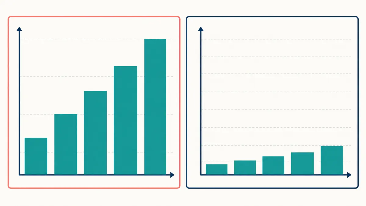
The axis can change the apparent size of the story
Axes influence meaning in several ways. A truncated baseline changes the apparent height of bars. A very narrow vertical range turns small fluctuations into steep peaks and drops. A wide range can flatten a meaningful change until it looks negligible. Reversing an axis changes the direction that most viewers associate with improvement or decline.
Aspect ratio matters too. Make a line chart tall and narrow, and its slopes become steeper. Stretch the same chart horizontally, and the movement looks calmer. UK Government Analysis Function guidance warns that the width-to-height ratio of a line chart can make change appear too extreme or too flat. There is no single correct ratio for every dataset, so the practical goal is a neutral frame that does not manufacture urgency or stability.
Before placing a chart on a slide, make three versions with different ranges or proportions. If the emotional message changes while the data do not, inspect the choice more carefully. Ask which version helps the audience judge the actual magnitude rather than the version that makes the presentation feel most impressive.
Dual axes can invent a relationship between two lines
A dual-axis chart places one scale on the left and another on the right. This allows variables with different units or ranges to share a frame, but it also gives the designer considerable control over where the lines cross, separate, or move in parallel. By adjusting either range, the same data can appear tightly related, weakly related, or headed toward an alarming intersection.
The UK Government Analysis Function generally recommends separating the datasets because dual-axis lines are easy to misinterpret and can manipulate the apparent story even unintentionally. Two small charts with aligned time periods usually require slightly more space but remove the false invitation to compare vertical positions directly.
If a dual axis is genuinely necessary, label each line directly, colour the matching axis carefully, state the units, and tell the audience what comparison is valid. Do not use similar slopes as evidence that one variable causes the other. The slide should also make clear whether the relationship was calculated or merely noticed.
Some visual comparisons are easier for the eye than others
People are generally more precise when comparing positions on a common scale or the lengths of aligned bars than when comparing areas, angles, volumes, or shades of colour. A landmark body of graphical-perception research by William Cleveland and Robert McGill helped establish this principle, and later research has continued to examine how different visual channels affect judgment.
This is why a simple bar chart often communicates small category differences better than a pie chart. Adjacent bar ends can be compared along one scale. Pie slices require viewers to compare angles or areas, which becomes difficult when several slices are similar. A bubble chart creates another problem: if a value doubles, should the circle’s diameter double or its area double? A careless scaling choice can make the visual increase much larger than the numerical one.
Three-dimensional charts add perspective to the problem. A pie slice angled toward the viewer may look larger than an equal slice at the back. Decorative depth can hide a baseline or make columns difficult to compare. If the third dimension does not encode a third variable that the audience must understand, it is usually decoration with a perceptual cost.
Colour can imply boundaries that the data do not contain
Colour is excellent for directing attention, grouping related items, or separating a small number of categories. It becomes less reliable when viewers must estimate exact quantities from shades. A dramatic heat map can turn a tiny difference into an apparent divide if the endpoints of the colour scale are close together. Without a visible legend, red may register as dangerous even when it means only slightly above average.
Do not make colour carry the entire meaning. Direct labels, patterns, line styles, or marker shapes can preserve the distinction for people with colour-vision differences and for slides viewed on poor projectors. The government chart guidance also recommends labelling categories directly when possible instead of forcing viewers to match colours with a separate key.
Use one accent colour for the series or value the audience should inspect, then keep supporting information quieter. This applies the same attention principle explained in CueLab’s guide on why an arrow changes what an audience notices first. The cue should support the comparison, not substitute for it.
A missing denominator can mislead without changing a number
A 50 percent increase sounds substantial. An increase from two cases to three is also 50 percent. Neither statement is mathematically wrong, but the percentage alone hides the scale. Relative change is useful when comparing rates; absolute values tell the audience what the change means in concrete terms. Important presentations often need both.
Context can disappear in other ways. A time series may begin immediately after an unusual low point. A comparison may omit the largest competitor. A survey chart may show percentages without sample size or question wording. A line may continue across a period when no data were collected. The Government Analysis Function advises that a break in a time series should be clearly highlighted rather than joined as though the missing interval were observed.
Uncertainty deserves similar care. A point estimate can look exact even when it comes from a small sample or has a wide confidence interval. Do not add technical error bars by habit if the audience cannot interpret them. Explain the range in plain language, show plausible outcomes, or provide a small annotation that states what is and is not known.
The slide title can either correct or amplify the problem
A topic label such as “Quarterly Results” makes viewers work out the message alone. A claim title such as “Customer retention improved, but the change is within the normal quarterly range” gives them a responsible reading target. It identifies both the pattern and the limitation.
This is a strong use of the claim-title approach discussed in why slide titles should make a claim. The title should not exaggerate what the chart proves, however. “Training caused sales to rise” is not justified by two lines that moved upward together. “Sales rose after training began” describes the sequence without inventing causation.
During delivery, state the valid comparison before discussing details: “Compare the height of the two blue bars; the grey bars are last year’s reference.” Give viewers a moment to find those marks. If the chart contains several stages, a progressive reveal may help, but keep comparison items visible together. CueLab’s static-slide and progressive-reveal comparison explains why revealing everything one item at a time can also make comparison harder.
Rebuild the chart around one audience task
When a chart feels crowded or slippery, return to the decision the audience must make. Do they need to compare categories, see a trend, understand a distribution, find an outlier, or judge uncertainty? Each task points toward a different visual form.
- For category comparison, begin with aligned bars or dots on a common scale.
- For change over time, use a line with a clearly labelled time axis and mark any missing period.
- For a distribution, show the spread rather than only an average.
- For part-to-whole relationships, use a pie only when the whole is meaningful and the categories are few and distinct.
- For two different measures over time, prefer aligned small charts over a dual axis.
Then remove elements that do not help that task: heavy gridlines, redundant legends, unexplained abbreviations, 3D effects, decorative icons, and excessive precision. Put essential labels next to the data. Keep the source and necessary method note readable, but do not make the audience decode a paragraph of fine print during the talk.
Test the impression, not only the numbers
Show the slide to someone who has not seen the analysis. Give them five seconds, hide it, and ask what changed, which group was larger, and how large the difference seemed. Their answer reveals the first impression your chart creates. Then show it again and ask what evidence supports that reading.
If the person identifies the wrong comparison, cannot find the units, or describes a modest change as enormous, do not explain the chart more forcefully. Revise the chart. A presentation should not depend on the audience resisting the most obvious visual interpretation.
A trustworthy chart does more than avoid false numbers. It makes scale visible, preserves relevant context, uses visual comparisons people can judge, and separates what the data show from what the presenter believes. That is the standard to use before the slide reaches the room.